
Sport pictograms for Olympic Winter Games PyeongChang 2018
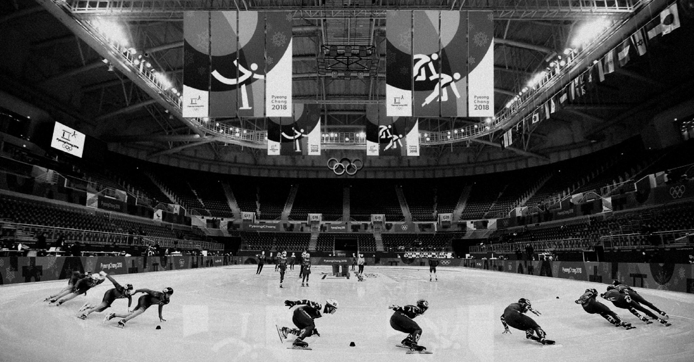
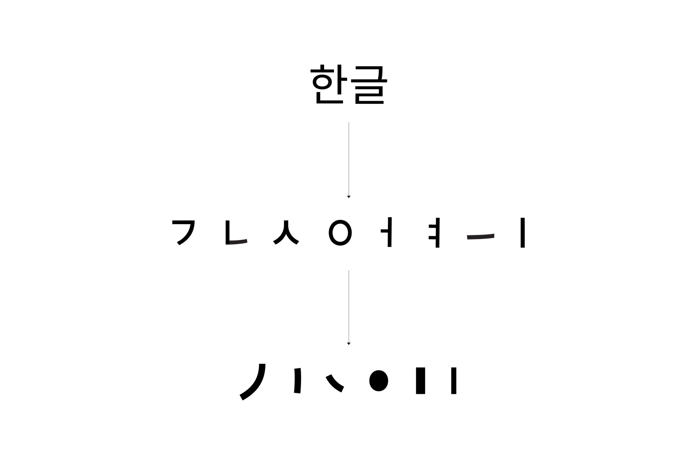
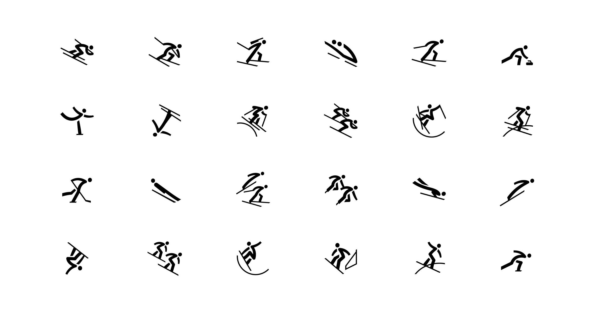
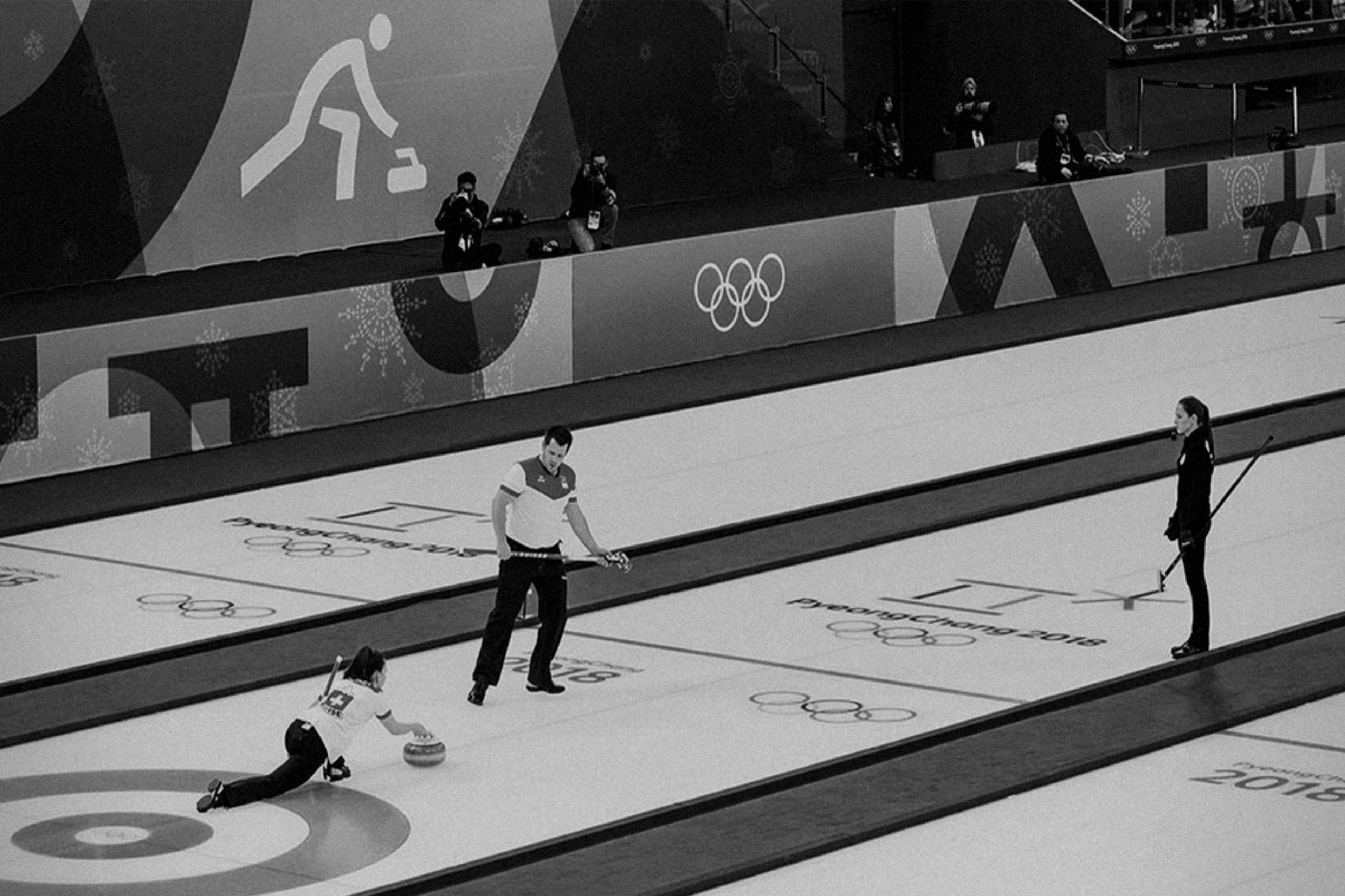
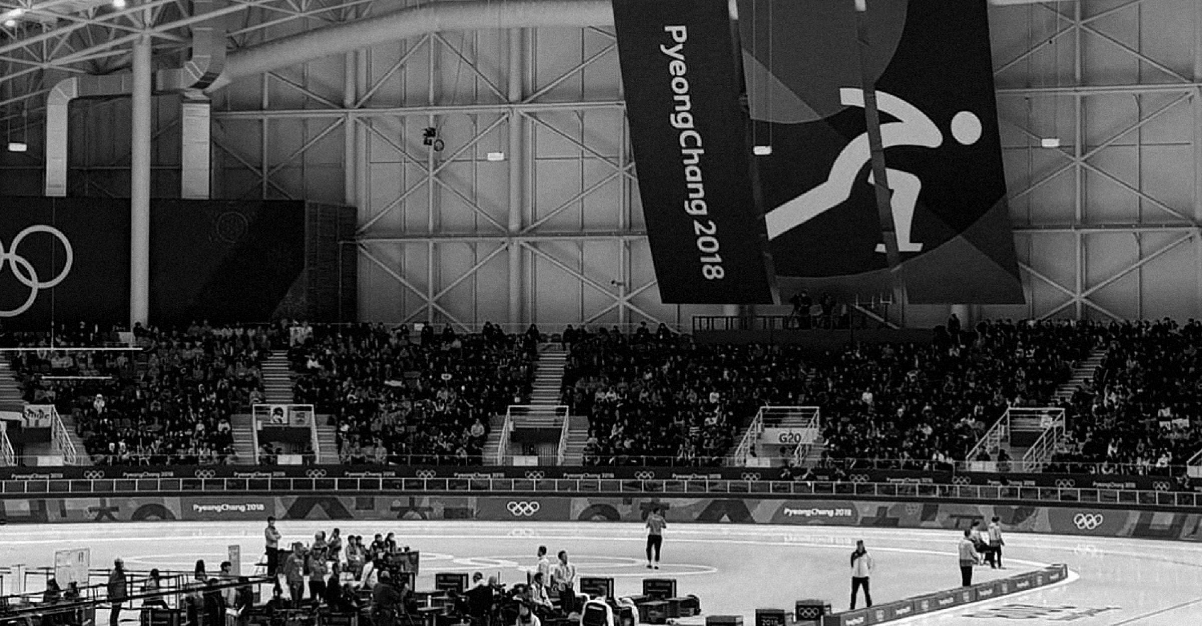
On 25 January 2017, the Organising Committee for the Olympic Winter Games PyeongChang (POCOG) unveiled the official sport pictograms that will be used to represent each of the events at next year’s Games. The pictograms are always a core part of the look and feel of each edition of an Olympic Games, and also a vital international “shorthand” for Olympic fans around the world. The design of the pictograms for PyeongChang is based on the Korean script or ‘Hangeul’, which was an alphabet developed in Korea in the 15th century and is still used today. As well as providing fans with an insight into Korean culture, the slanted and curved lines of the Hangeul characters have been used to create dynamic images that capture the movements of the athletes and seek to embody the Olympic spirit. There are 24 pictograms in total, all of which are based on four consonants and three vowels from the Hangeul alphabet. While there are 15 disciplines that feature on the Olympic Winter Games programme, some sports have more than one pictogram. For example, Alpine skiing has two separate pictograms, one for the ‘technical’ events and one for the ‘speed’ events, while snowboard has no less than five different pictograms.
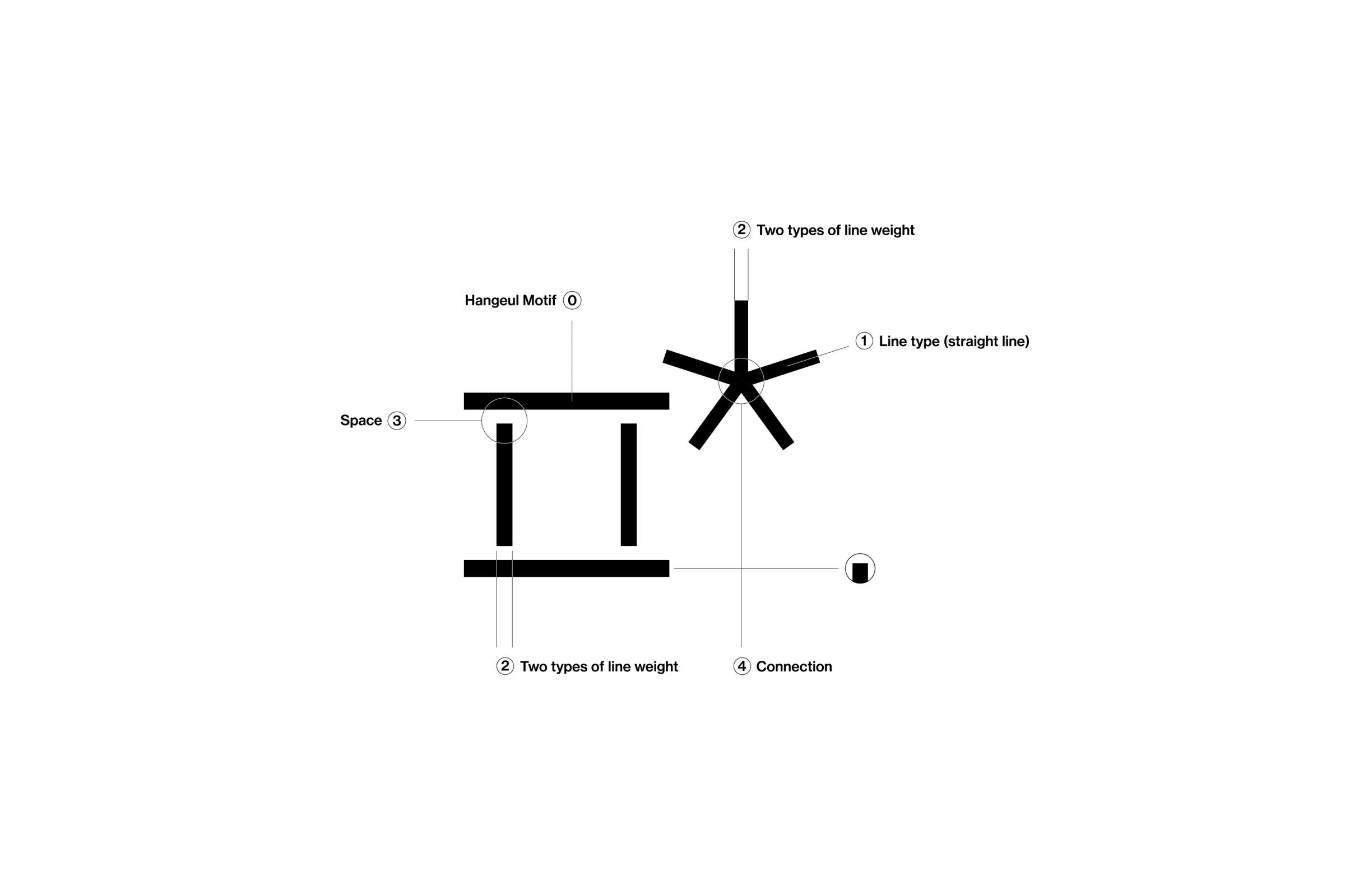
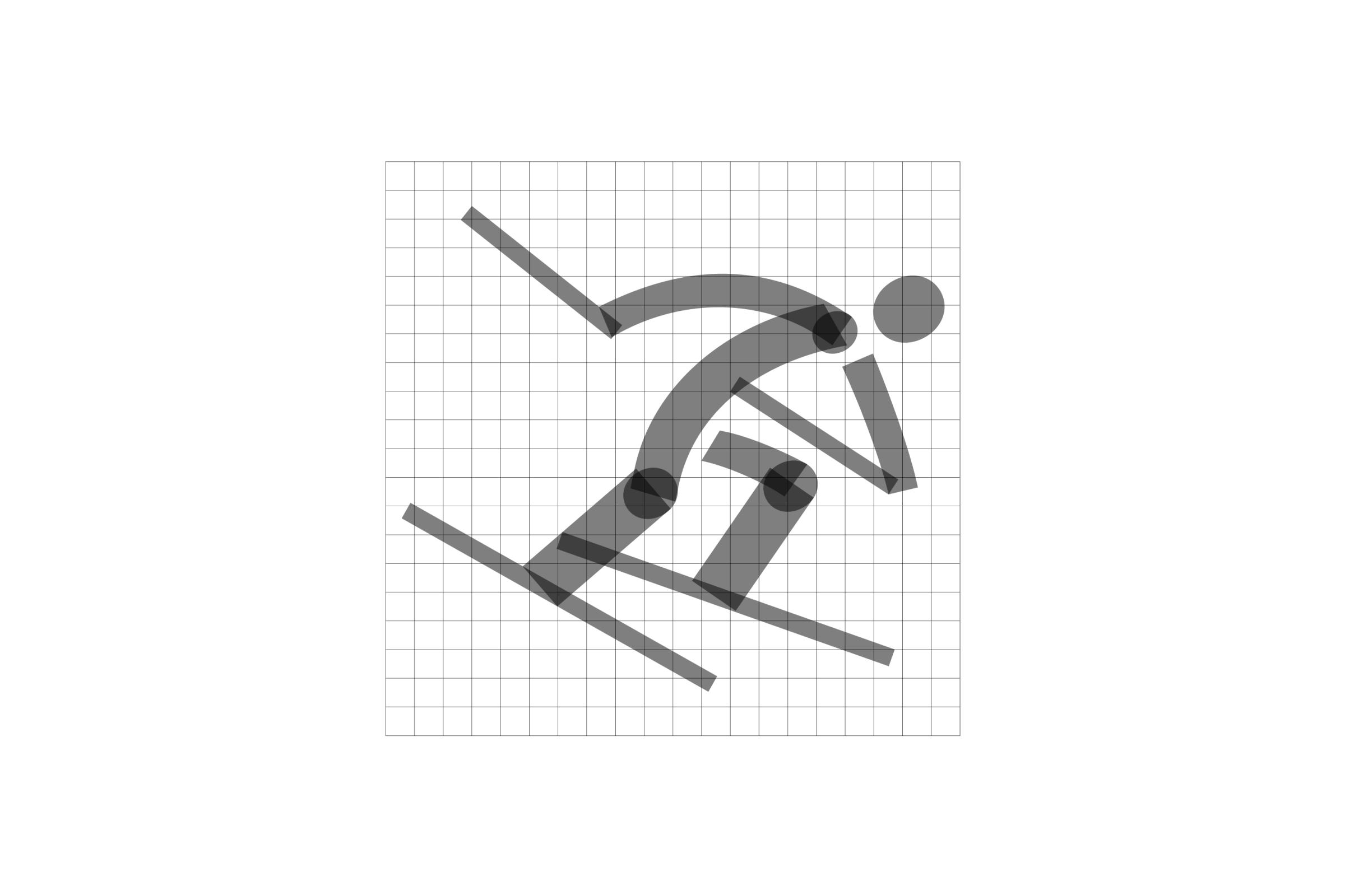
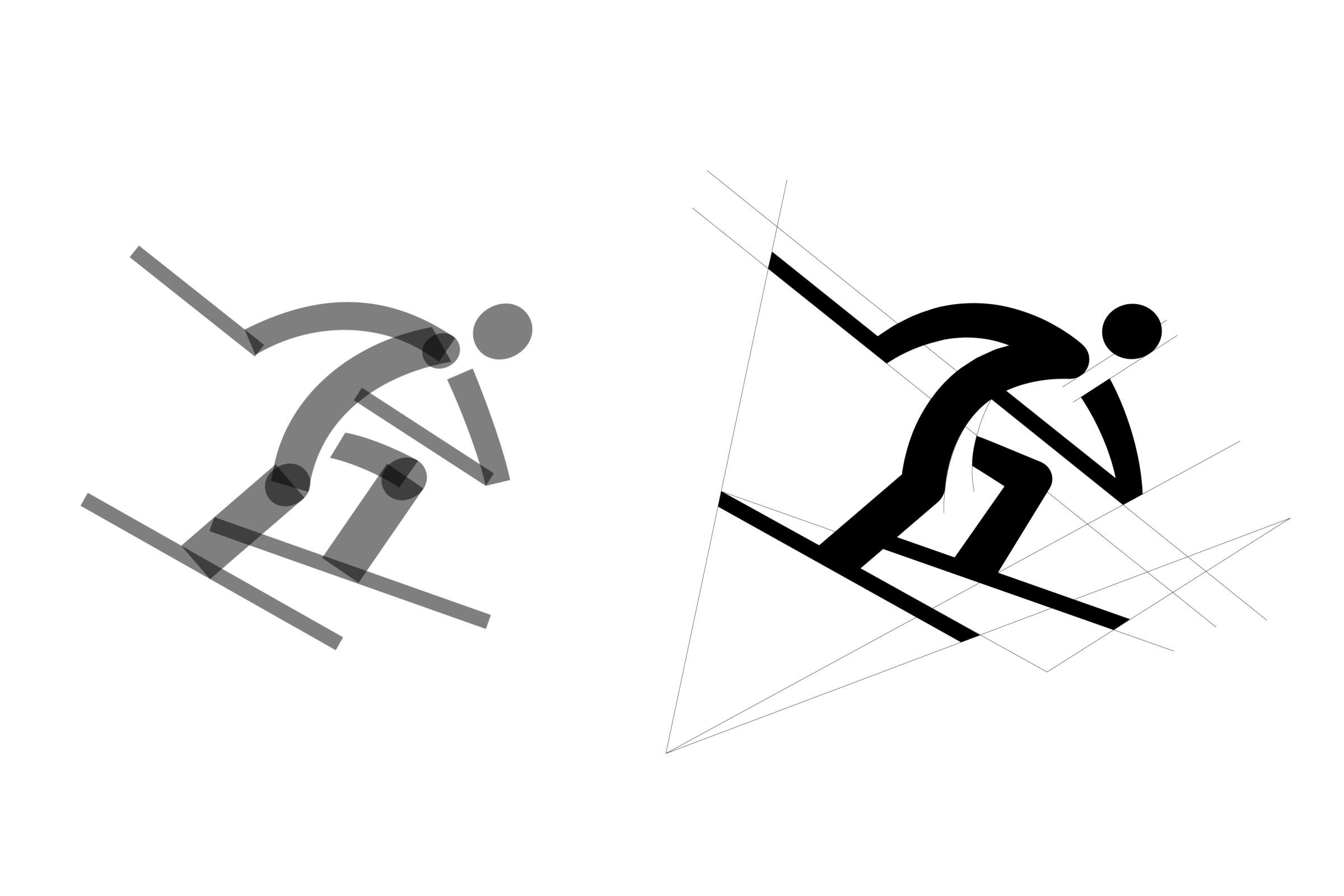
The vision of the Olympic and Paralympic Winter Games PyeongChang 2018 is to open up a new horizon of winter sports with people from around the world on the new stage of Pyeong- Chang with great potential and to leave a sustainable legacy for Gangwon Province and Korea. The pictograms for the Games have been designed based on Hangeul, the Korean alphabet, which is an excellent system of letters unique to Korea. Hangeul, used as a motif for the emblem of PyeongChang 2018, represents the identity of the Games. The shape of the lines of the Hangeul letters "ᄑ" and "ᄎ" from "평창," the Korean word for PyeongChang and the commonality found in the shape of consonants and vowels of Hangeul have been analysed and reflected in the pictograms, thus representing the identity of the Games through the identity of Hangeul. Through it, the unique beauty of Hangeul and the image of Korea are introduced to the world. Also, through the pictograms, the Olympic spirit is expressed such as the infinite potential, the challenging spirit and passion that athletes will show in each game so that it can be shared among people across the world. The pictograms for PyeongChang 2018 used Hangeul, Korea's unique alphabet, as a motif. After analysis of the 14 consonants and 16 vowels of Hangeul, four consonants (ᄀ, ᄂ, ᄉ, ᄋ) and three vowels (ᅦ, ᅨ, ᅴ) were selected, and each pictogram was designed based on the straight and curved lines unique to the consonants and vowels. For the pictograms of PyeongChang 2018, the most representative poses of each discipline have been chosen and represented in a minimal- istic way. The pictograms have been further refined in their detailed poses through the use of slanted lines and curves to express the movements of joints, which gives more dynamism to the pictograms.
Partakers : Haam Younghoon (Creative director, Graphic design)